UX / UI design, User research
About Trapview
Trapview is a solution that effectively helps to make decisions about crop protection. It provides users with an overview of the situation in the field, predicts future events and simulates various scenarios of plant protection measures.
EFOS d.o.o.
IT, Agriculture
UX / UI Redesign of Web App
2022 – 2024
My Role
I collaborated as a supporting UX / UI Designer under a Principal Designer, working closely with stakeholders, developers and end users to redesign the application around real user needs and business goals.
- Conducted user interviews to understand workflows, pain points and expectations
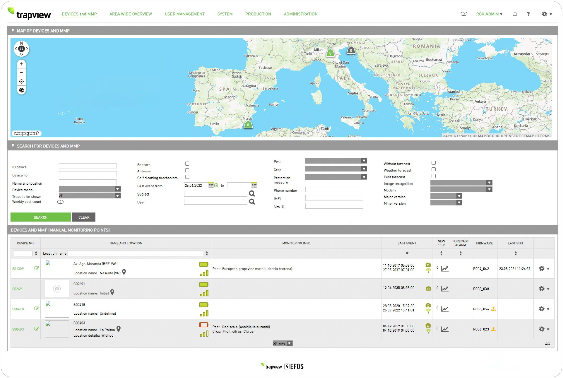
- Analyzed the existing information architecture and identified key usability and navigation issues
- Designed a new information architecture, navigation system, user flows and high-fidelity wireframes
- Worked closely with developers and stakeholders to ensure the proposed solutions were both user-centered and technically feasible


The Problem
The existing web application had become difficult to navigate due to an unclear information architecture and inconsistent menu hierarchy. Users often struggled to find key features, lost their orientation within the application, and had to rely on trial and error to complete common tasks. As a result, even simple workflows—such as running quick analyses—were unnecessarily time-consuming and frustrating.
The Solution
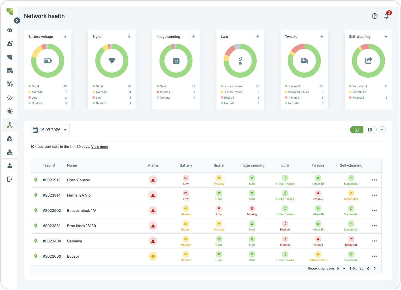
The redesign aimed to create a more intuitive and accessible experience by simplifying the navigation, improving the information architecture, and making essential functionality easier to discover. The goal was to reduce cognitive load, increase efficiency, and ensure the application could be used confidently by both experienced users and those with limited digital skills. Visually the web app had to follow the already redesigned mobile app, which managed to overcome most of those issues.
User Research
To achieve the project goals, it was essential to first understand the application’s users, their habits, and how they interacted with the existing app. I’ve explored what worked well for them, what caused frustration, which features they valued, and what they felt could be removed without affecting their workflow.
The research focused on identifying key pain points and uncovering the needs of different user groups through in-house workshops and interviews with key users. These insights were then synthesized into a unified solution that balanced diverse perspectives and addressed the needs of multiple user personas.

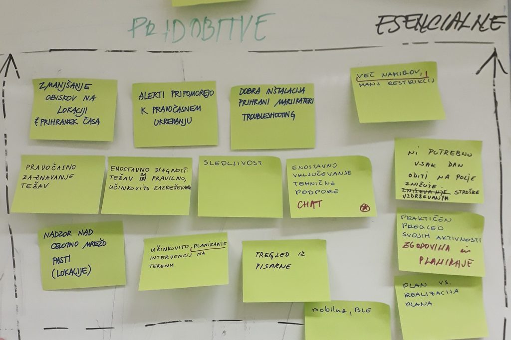
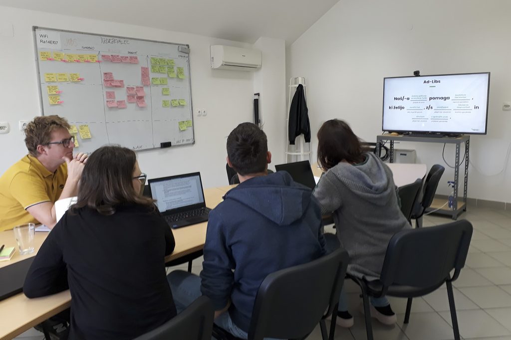
As part of the research phase, I’ve conducted 9 in-depth interviews with key customers who were also regular app users.
These conversations provided valuable insights into their workflows, expectations and everyday challenges. The research revealed the following key findings:
- Navigating through the application is not intuitive
- Too many clicks to reach the goal
- Data display should be as visual as possible
- Users need simple and short informations
- Interface design should be simple like in the mobile app
- Different interfaces for different types of users

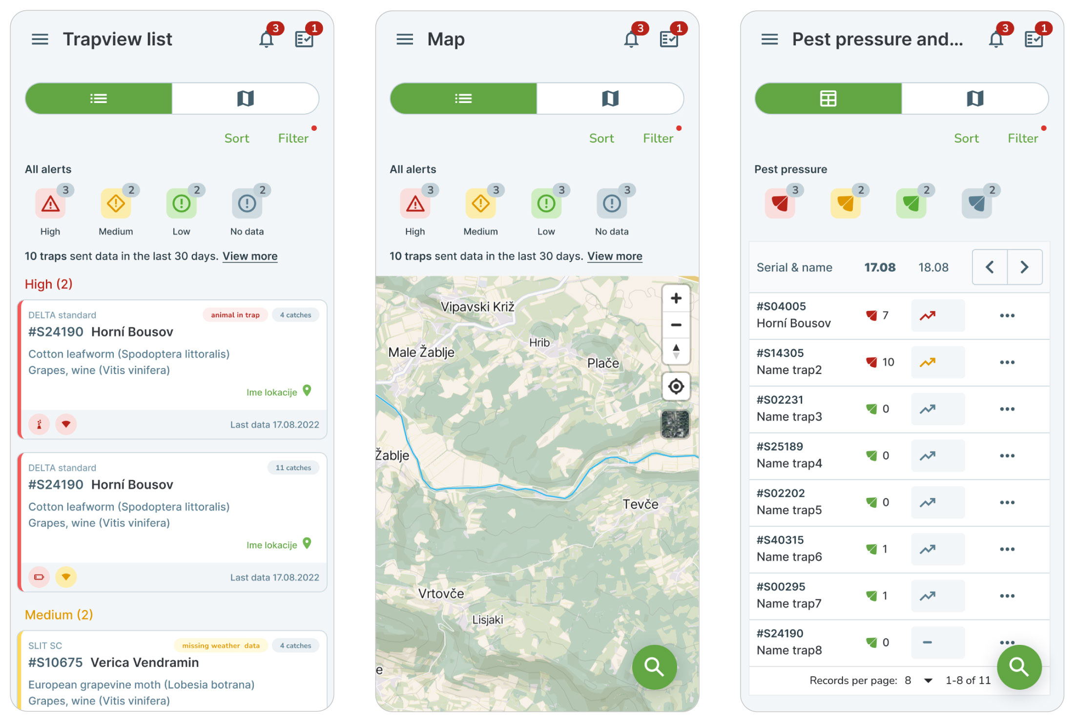
Users want to see the forecast, analyze it quickly and take advantage of its simplicity
The user’s primary focus is on the value the application brings, not on the additional “work” they have to put in to make the product work in their favor.


Trapview is an AI-based decision support system that enables efficient food production and reduces environmental impact.
Value Proposition


Outcomes
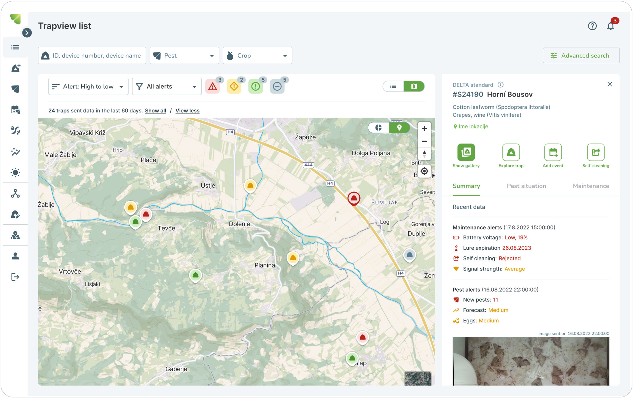
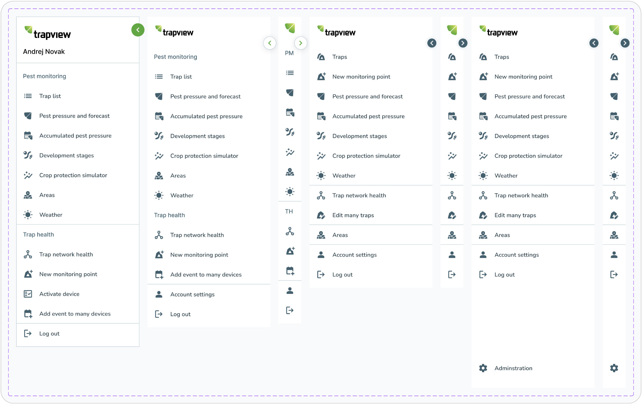
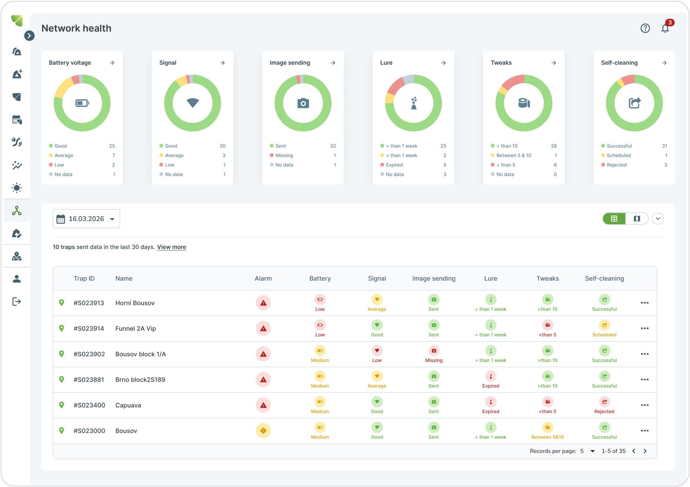
The redesign transformed a complex and difficult-to-navigate application into a more intuitive and user-friendly experience. By improving the information architecture, simplifying navigation, and making key features easier to discover, users were able to complete tasks more efficiently, with greater confidence and less cognitive effort.
These improvements transformed the application into a more efficient and accessible tool, reducing user frustration while making everyday workflows faster and easier to complete.
What Was Delivered
- A simplified information architecture with a clear and consistent navigation hierarchy
- Faster access to frequently used features and analysis tools
- Streamlined user flows that reduced the number of steps required to complete common tasks
- A more intuitive interface that improved usability for both experienced users and users with limited digital skills
